So i decided i didnt want to do illustration as i did that for D&AD and i wanted to do something different.
My new idea still plays on the whole government theme but influenced in a different, this time its from this video..
Really like this awakening video and want to do something with the words "Everything is ok".
Tuesday, 5 April 2011

Creating the visual
I did a rough draft when i first came up with the idea and that looks like this...
 You can see what the idea is more clearly now.
I drew out the quote which would be bleeding and it looks like this..
 and a close up...
 Its drawing is a bit slanted but i can edit that in photoshop.

I drew out the quote which would be bleeding and it looks like this..


Government/Rebel Typography
With this idea i thought it would be best to look at some of other people designs and how they put across their message.
 Not much to this but i like the american flag as the text.
 This is like my idea but instead the text is in blood.
 This is a fantastic poster, i love the way it reads as two things, long and short story of the whole sentence. The typography isnt too exciting though.
 I really like this design, i like how its in two languages and the statement at the top. The statement is asking a question of rebellion and the right side has given me an idea that i could do something like this but on the Libya conflict that happening at the moment.
 This is good because it combines different design techniques than just type, and also fill the sentence will images as words.


The idea
Ive been watching a lot todo about government lies lately and i want to have a design which inturprets theres lies, so the idea is the have a statement of what a government spokes person has said (which is the lie) and have it bleeding and within the blood is the what he actually means e.g. the top would say "The U.S. government wants democracy in Iraq and the Middle East." that would then be bleeding and the drips of the blood would say "The U.S. government wants oil and power in Iraq and the Middle East."
This idea came mainly from the Nicolas Girard research i did, he did dripping text.
This idea came mainly from the Nicolas Girard research i did, he did dripping text.
Brainstrorm

What does "fake' mean?
The definition of fake which is from thefreedictionary.com
fake 1 (f k)
k)
The brief says
"The english language has many synonyms for the word "fake" - forgery, counterfeit, copy, pirate, sham, fraud, hoax, imitation, mock-up, dummy, reproduction, phoney, rip-off, dupe..."
fake 1 (f
k)adj.
Having a false or misleading appearance; fraudulent.
n.
1. One that is not authentic or genuine; a sham.
2. Sports A brief feint or aborted change of direction intended to mislead one's opponent or the opposing team.
v. faked, fak·ing, fakes
v.tr.1. To contrive and present as genuine; counterfeit.
2. To simulate; feign.
3. Music To improvise (a passage).
4. Sports To deceive (an opponent) with a fake. Often used with ouThe brief says
"The english language has many synonyms for the word "fake" - forgery, counterfeit, copy, pirate, sham, fraud, hoax, imitation, mock-up, dummy, reproduction, phoney, rip-off, dupe..."
Nice website.
I found this really cool website which shows typography in a different light, when you search typography in google image it all looks the same but i like this site because the pictures/design do something different.
http://blog.wearebuild.com/tag/typography/
Images from the site which i thought were most inspirational to me and this project..

 I like these two because they arent computer made but photos of typography in life especially the top one which looks like its stickers on a van door.
I like this typography because its not using type but yet still looks amazing.


http://blog.wearebuild.com/tag/typography/
Images from the site which i thought were most inspirational to me and this project..


I like this typography because its not using type but yet still looks amazing.


Thursday, 31 March 2011
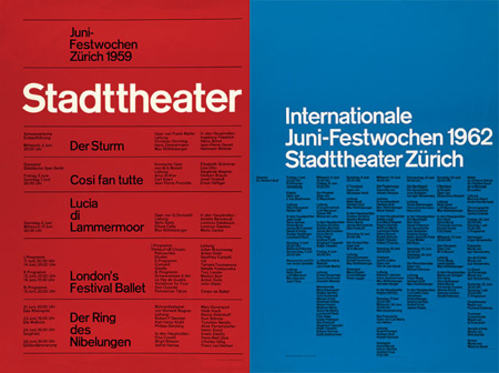


Thursday, 17 March 2011
Nicolas Girard
I was looking and some typography designs and i found this one design which i really liked so i decided to look at the other stuff from this artist.


He has other stuff but these are the ones i really like, I like the idea of dripping/melting text and i would love to recreate that as it would work really well for fakery, the top image looks great because the added effects make it jump of the page and if combined with the 2 below would look better - maybe something i could do.
http://dribbble.com/nicolas/tags/typography


He has other stuff but these are the ones i really like, I like the idea of dripping/melting text and i would love to recreate that as it would work really well for fakery, the top image looks great because the added effects make it jump of the page and if combined with the 2 below would look better - maybe something i could do.
http://dribbble.com/nicolas/tags/typography
Wednesday, 16 March 2011
Typography Making Images


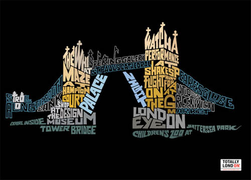
Some examples of typography that makes me hate this style...


Tuesday, 15 March 2011
Typography posters

I found some image in previous post about typography in real life and this has that feel to it, the wood chipping converting into type as they carve out the letter "g" in the wood.

Ive seen alot of this style, i think this image would maybe look better if the type was slighty curved so it would give the illusion of a round glass.


I really like this and the one above because of how they have a block sentence which they then emphasize certain words by changing the size and/or the font.

Same artist who did the BAD TYPOGRAPHY in the post below, artist name: Craig Ward
Im not the biggest of fans when it comes to typography so i find when it mixes with other stuff this for example has water marks, it looks so much better. The font is really good on this image giving it a classy smart look.

This is like the Guinness pint one but a bit different, i like this one alot especially the "March 21 2008" which is the bottom of the hat, it gives it something different.
Tuesday, 1 February 2011
Research
Heres a few typo designs ive been looking at..


I found these two similar typo designs.

This design uses a lot of type faces and when it combines with a lot of different image i think it makes sense. The design is very arty (marmite - like it or hate it) but i really like it and i could do this to represent a fake person and how they think by using loads of typefaces and images.
 I really like how the "S" is designed, the words are very nicely fitting around each other making up an unusual shape. I like the leading changed throughout the design and the different size of type which if this was english may make more sense and have a bigger impact on me.
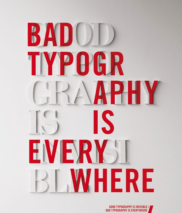
I like how this typography is designed in the same way in what it states in the design, a clever technique and the choice of colours makes it stand out. One key aspect i enjoy about this is the break up of the words and how the red text hides most of the white.


I really like when typography is mixed with other stuff to give it more of an edge, in this example the watermarks set off the typography due to the sharpness diffrence between the two.

I found these two similar typo designs.


The Brief
ISTD (International Society of Typography Designers) have set 4 briefs and i have to choose one, the one i have chosen is this..
 The brief is called fakery.
I like this brief the best as its the hardest but it has to most potential if i can get a good idea.

I like this brief the best as its the hardest but it has to most potential if i can get a good idea.
Subscribe to:
Posts (Atom)