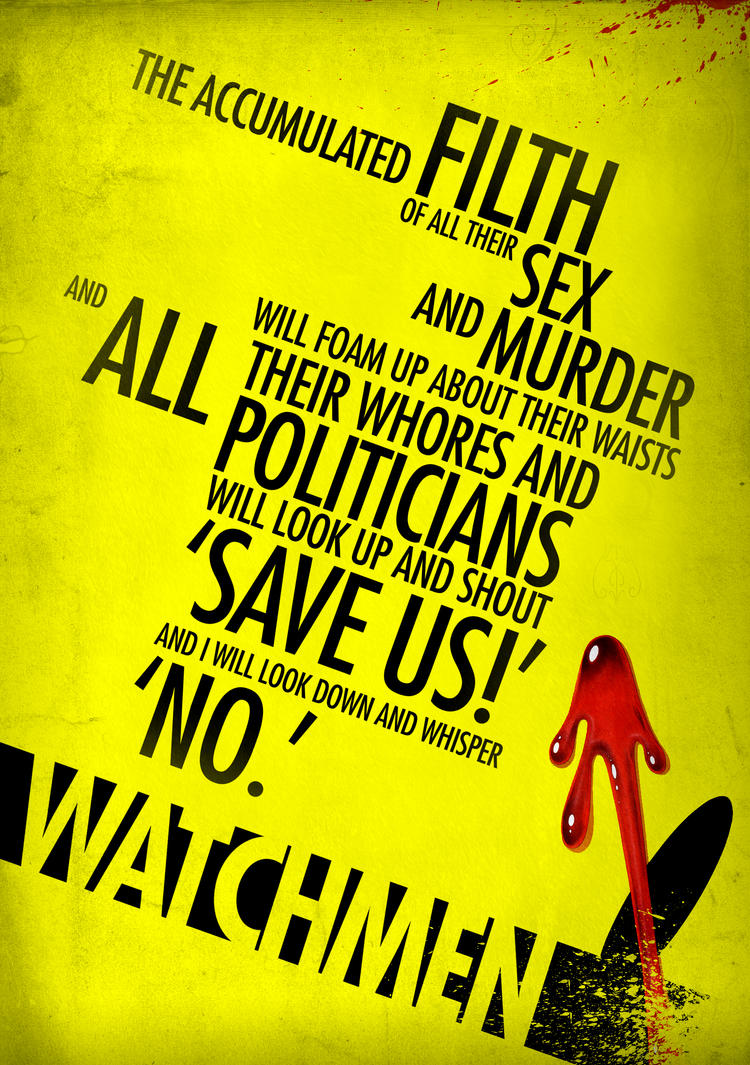
I love the hierarchy in all of these posters, they express the key words much better by putting them in a larger scale. The leading is the same on all these but that maybe because there was no need for different leading. These are all of film quotes but i dont want to do anything from a film but i can take how they expressed each word from them especially because theres only 1 font per poster.
The bottom image is very inspiring, i like how it uses a hierarchy of type to emphasize certain words and a change of font to emphasize other words. The same with the american one but i dont like that one nearly as much as the bottom one, the simple saturation turned down colours they use look really good.


No comments:
Post a Comment