Heres a few typo designs ive been looking at..
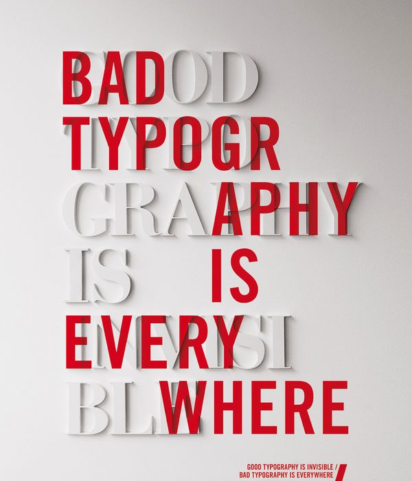
I like how this typography is designed in the same way in what it states in the design, a clever technique and the choice of colours makes it stand out. One key aspect i enjoy about this is the break up of the words and how the red text hides most of the white.
I really like when typography is mixed with other stuff to give it more of an edge, in this example the watermarks set off the typography due to the sharpness diffrence between the two.
I found these two similar typo designs.
This design uses a lot of type faces and when it combines with a lot of different image i think it makes sense. The design is very arty (marmite - like it or hate it) but i really like it and i could do this to represent a fake person and how they think by using loads of typefaces and images.
I really like how the "S" is designed, the words are very nicely fitting around each other making up an unusual shape. I like the leading changed throughout the design and the different size of type which if this was english may make more sense and have a bigger impact on me.


